The Hear Florida Audiology Group identity package started with only a logo and then extended to marketing materials and a stationery suite as the business expanded. The request was to design materials that were modern and clean to reflect the medical field yet catered to the tastes of a senior market. The color palette selected for the primary logo design aligned to the client's alma mater, the University of Florida. The complete brand palette incorporated the fresh coastal colors of Florida including lime green and teal. The logo mark combined the ear with the outline of the state of Florida, which struck a delightful chord of surprise with the client.
Content-heavy brochures were designed in both English and Spanish to attract patients in the South Florida tri-county area. The design of the collateral delivered on the clinical requirements for the brand while infusing fresh visual elements to create interest.
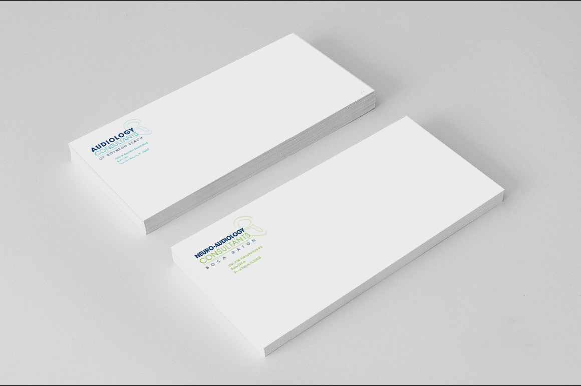
As the group expanded through acquisition, a stationery set was requested for each branch of the practice. The client requested complementary logos using the "ear" icon for each location, as shown in the business cards, letterhead and envelopes below. A watercolor brushstroke graphic was also incorporated into each location's logo to subtly promote the coastal feel and help tie together the seemingly unrelated practice names. The Hear Florida brand elements combined with these new logos to complete each look and create a brand family. An appointment card was included on the back of the business cards.


The patient information form shown below was ordered in Spanish to help support the growing business in the hispanic market.
CREDITS:
Design, Production and Print Management: Mary Sarlo Carmichael


