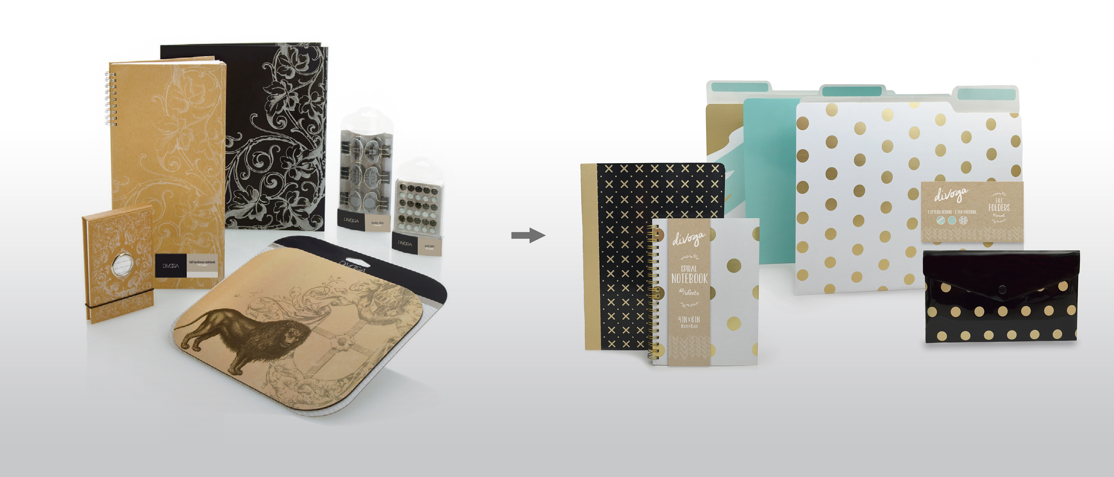
When Office Depot merged with OfficeMax, the Divoga brand needed to be redesigned to fit the newly formed Private Brand architecture. The former OfficeMax Divoga brand was characterized by professional, fashion-oriented products that were limited to office supplies. The go-forward brand was more winsome and imaginative and included products from back-to-school, tech and business in addition to core supplies. The goal of the redesign was to create a new identity, packaging and retail display solutions to cater to the new demographic, support the change in product styling and expansion of product categories.
The updated logo had a loose, handwritten style that is more personal. It represented individual, youthful character. The former logo, product style and package design mimicked high fashion, including the logo that had a nod to Gucci and Chanel. It attracted more mature, stylish professionals. The new creative was designed to be free-spirited and organic to appeal to the new market of customers that enjoy products that make them feel like part of the creative process.

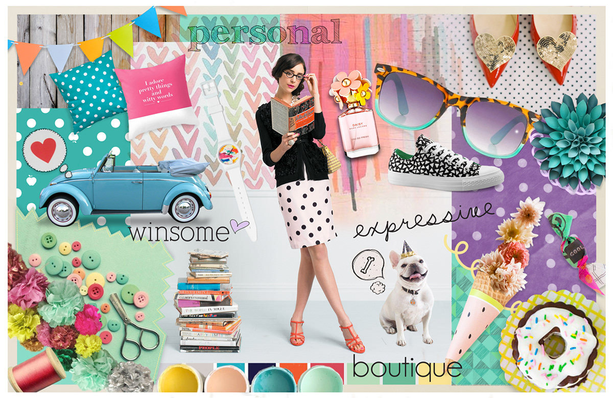
As with all other brand redesigns for the new Private Brand consolidated architecture, exploration of the new brand's personality was explored through tools like the moodboards shown below. Ultimately, the concept shown on the left was selected as the go-forward direction.

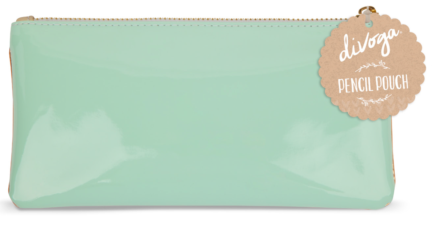
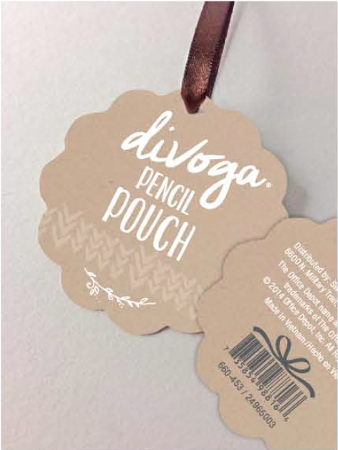
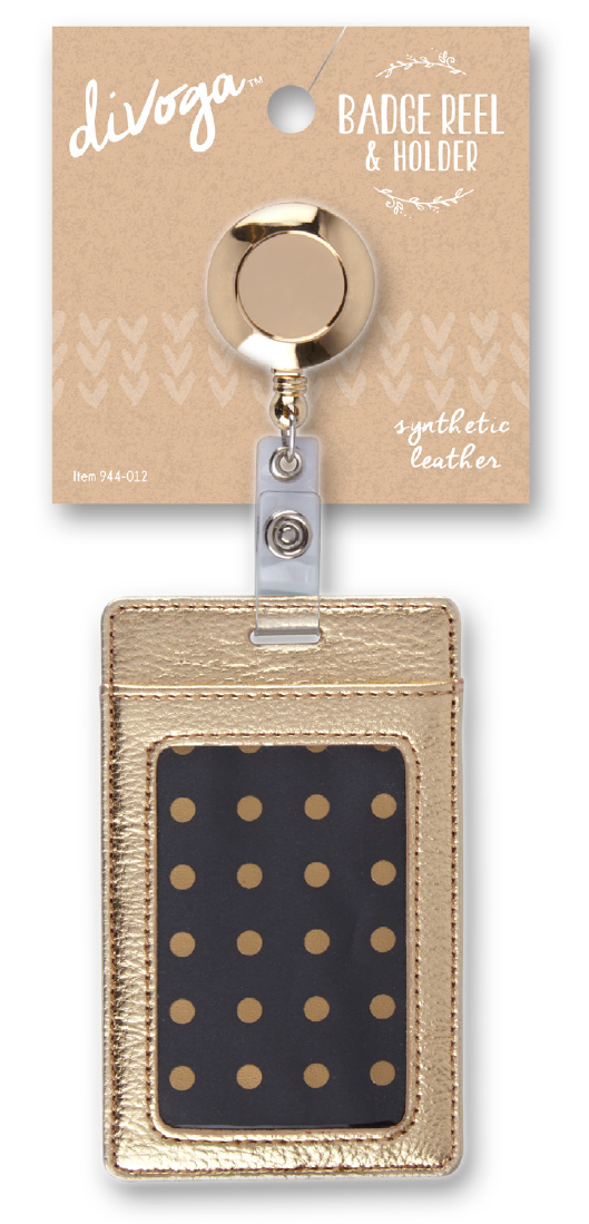
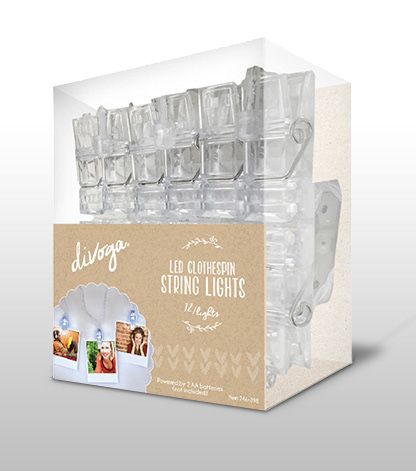
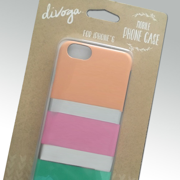
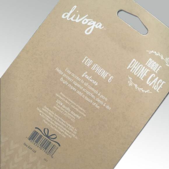
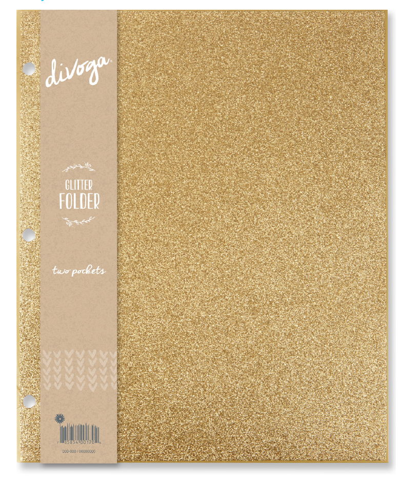
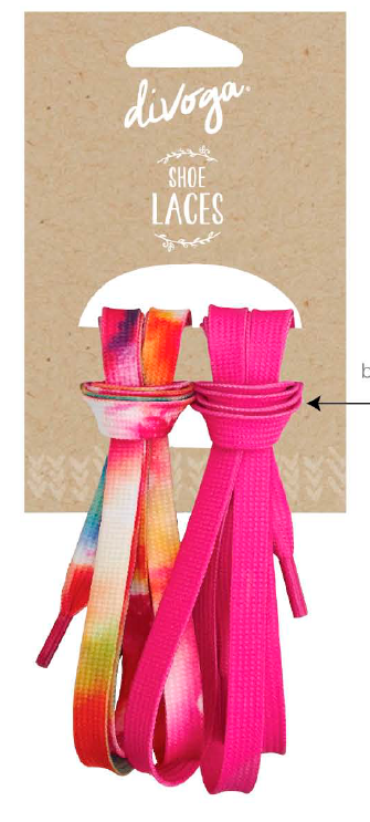
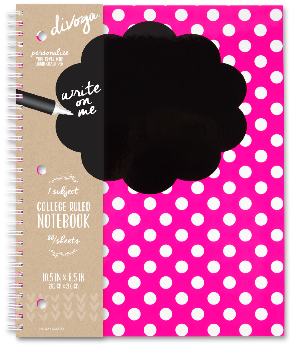
The packaging was designed to be minimal and neutral, allowing the colorful patterns and products to shine. An uncoated, textured kraft stock easily complemented the seasonally changing colors and patterns of the Divoga product line. The typography selected was playful and expressive, yet kept simplistic through the use of white-only text. The combination of these elements resulted in a solution that was passive, personable, and inviting. Vanity barcodes added something unexpected and fun to the package design. Although subtle, vanity barcodes are powerful assets that create loyalty among customers in an ever-crowded and competitive market.


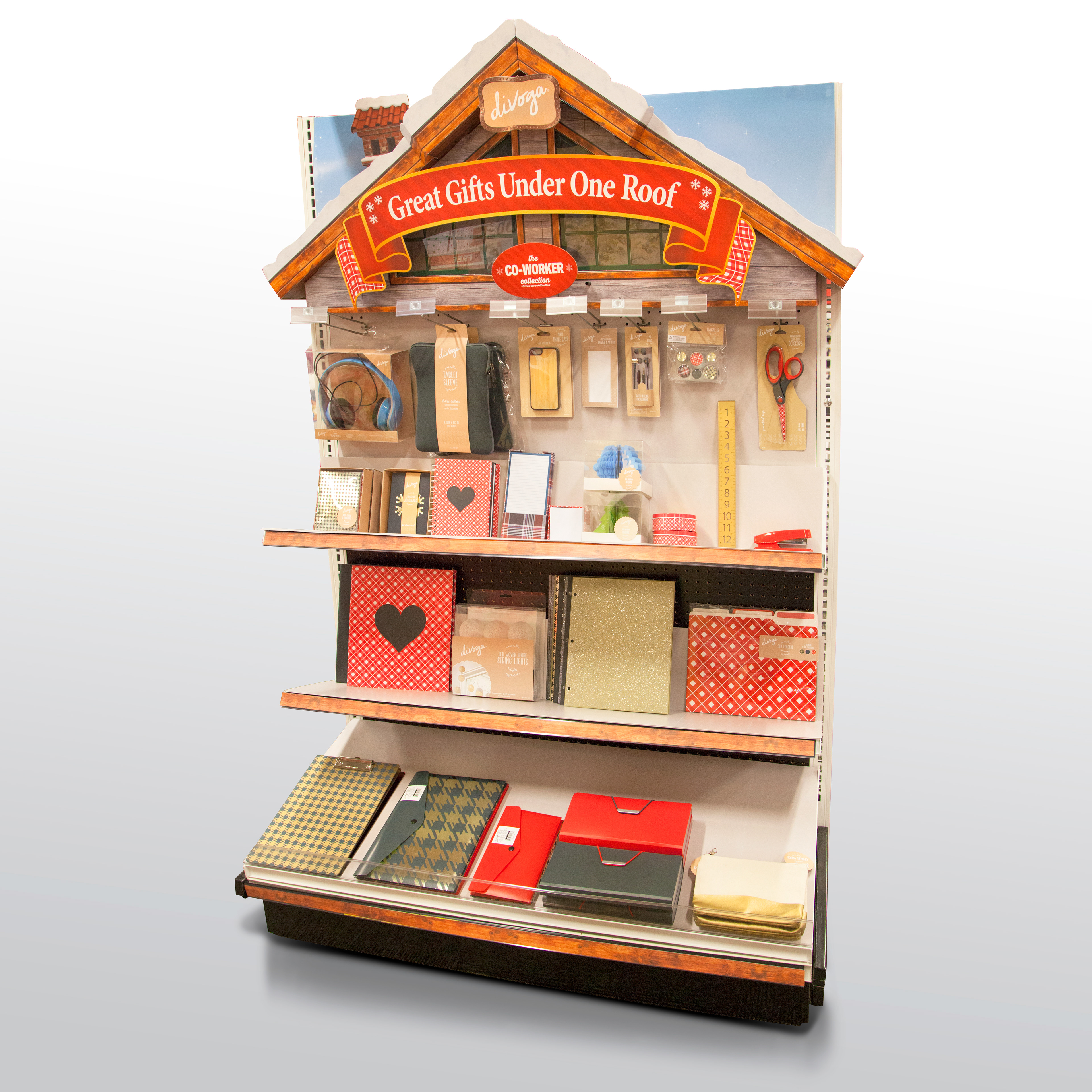
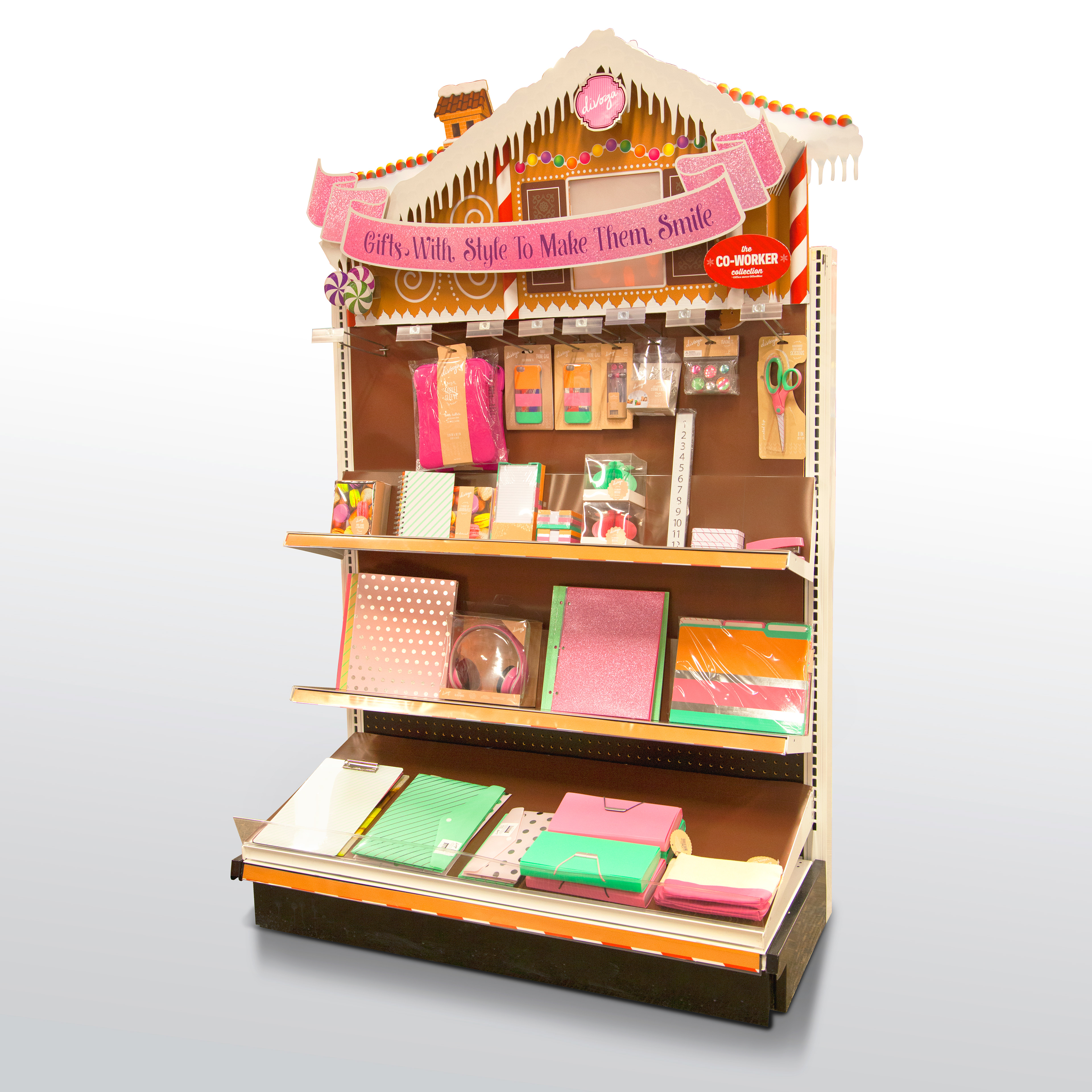
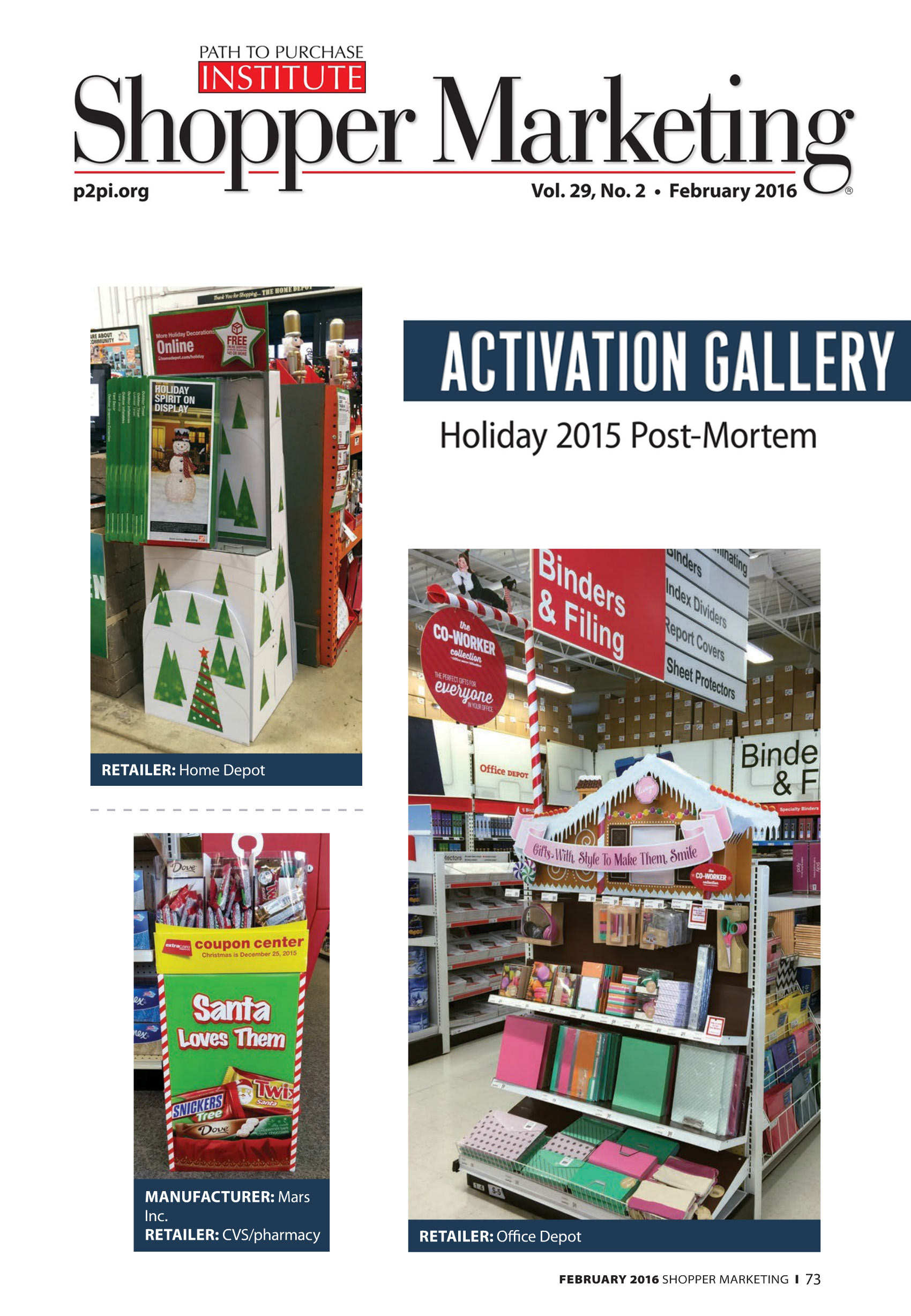
The endcap displays shown below delivered an inviting and whimsical holiday shopping environment. The visual merchandising solutions were constructed three-dimensionally and were equipped with lighting and holiday music triggered via motion sensor. The gingerbread endcap (center) was also featured in Shopper Marketing magazine in their Holiday Post-Mortem.
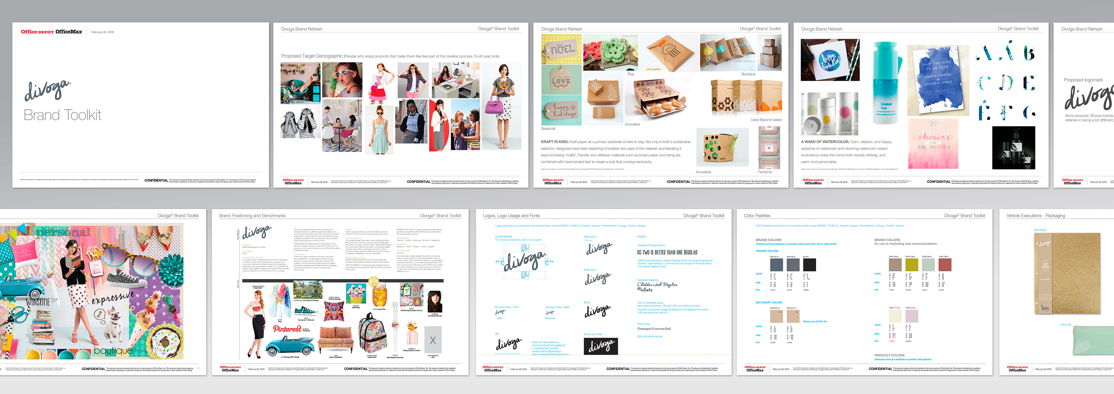
A toolkit for each brand in the Office Depot Private Brand portfolio was created to communicate and regulate changes from old to new brand design. The intention of the toolkit was to share and police the internal usage of assets and then to serve as a footprint for the full brand guidelines to be designed by an outside agency.
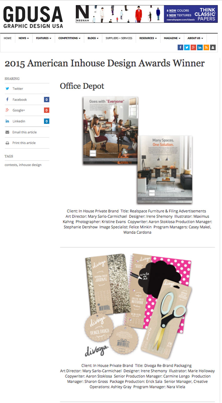
The new package design was also awarded a 2015 InHouse Design Award for packaging.


CREDITS:
Creative Director: Mary Sarlo Carmichael
Sr. Design Manager: Debby Ryan
Designers: Irene Shemony, Karla Butler, Erick Sala. John Salazar
Photographer: Kristine Evans
Copywriter: Aaron Stoklosa
Sr. Production Manager: Carmine Longo
Production Designers: Erick Sala, Terry Coffy, Rodrigo Patino
Print Manager: Sharon Gross
Sr. Design Manager: Debby Ryan
Designers: Irene Shemony, Karla Butler, Erick Sala. John Salazar
Photographer: Kristine Evans
Copywriter: Aaron Stoklosa
Sr. Production Manager: Carmine Longo
Production Designers: Erick Sala, Terry Coffy, Rodrigo Patino
Print Manager: Sharon Gross

